With the rising DIY interior decor enthusiasts and the fact that color is a key component of home renovation projects, it is highly advised to obtain a thorough understanding of the color wheel to determine which colors are best for your home. With the help of this blog, get the hang of it and comprehend the color wheel.
A house comes to life with color. It has the power to calm, excite, and warm us. A clever use of color can create the illusion of more space in small spaces or coziness in large ones. It can blur out ugly features while sharply highlighting elaborate and fascinating ones. It can give your entire interior design scheme a boost of energy and refinement. Home decorators have never had so many color options, and the selections just keep getting wider, which frequently causes more uncertainty and indecision! So let’s get to know about Color Wheel and its Theory.
Color Wheel Theory
Though that is also very important, having a basic understanding of color theory will help you make color decisions that go beyond your first instinct when it comes to a color scheme. Even if you ultimately choose to disobey every rule, it is still beneficial to spend some time learning the fundamental color tricks and guidelines. Color has always been a means of expressing oneself!
It is three centuries since Sir Issac Newton, using a glass prism to focus pure white light onto a neutral background, saw a continuous band of blending colors ranging from red to orange, yellow, green, blue, and violet. Essentially, what he had seen was a miniature version of a rainbow, which is produced when light streams through raindrops, projecting colors from the spectrum across the sky like a massive color slide.
What is a Color Wheel?
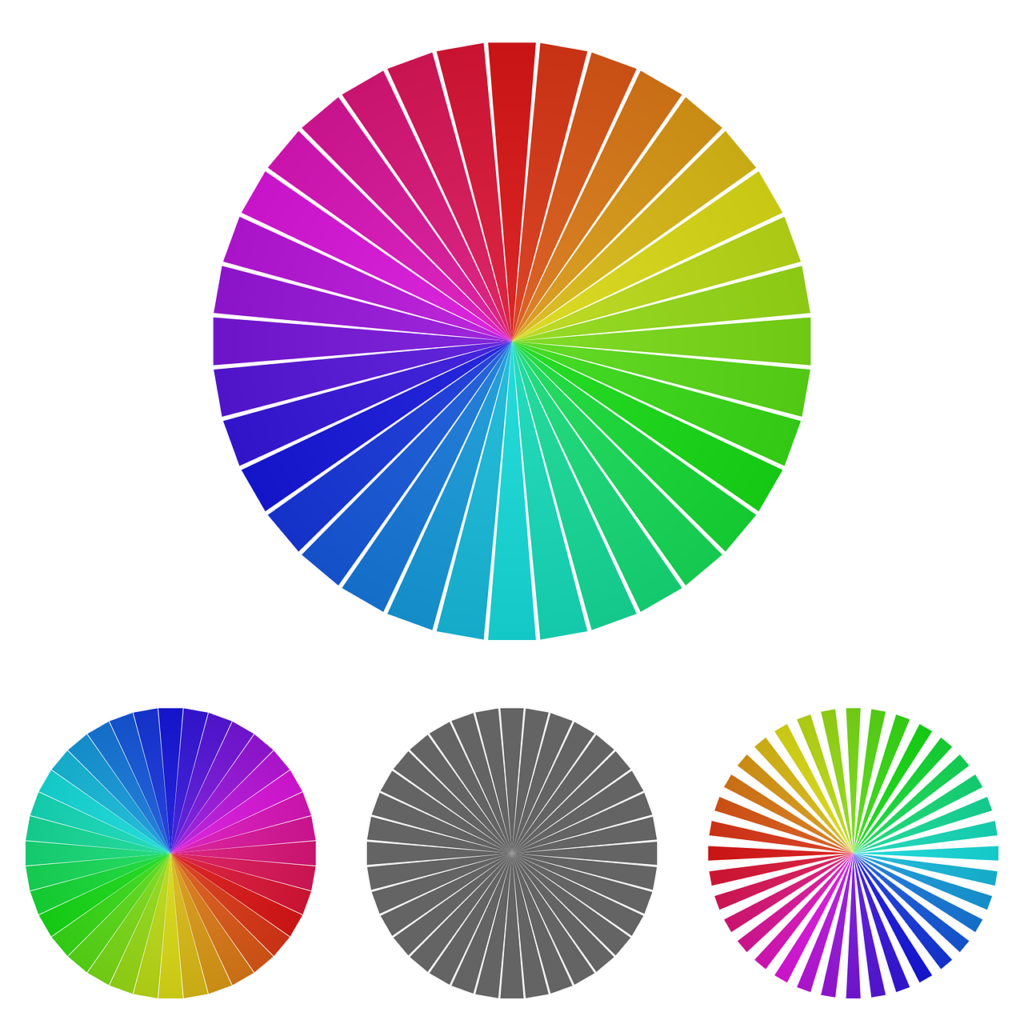
colors are represented visually on a color wheel, where hues are arranged based on wavelength. color wheels make it possible to express color relationships geometrically and illustrate how primary, secondary, and tertiary colors relate to one another.
The primary colors of the traditional RYB color wheel are blue, yellow, and red. By combining primary colors, secondary colors such as orange, green, and purple can be produced. Orange is made of red and yellow. Green produce by yellow and blue. Purple is made of red and blue. I take it you recall this from elementary school?
Tertiary colors produce by combining primary and secondary colors.
There are numerous variations of the color wheel, but many that feature these three kinds of relationships display twelve colors.
Opticks, written by Sir Isaac Newton in 1704, contains the first color wheel formulation. The seven colors that make up Newton’s asymmetrical color wheel are red, orange, yellow, green, blue, indigo, and violet. Johann Wolfgang Von Goethe created a symmetrical color wheel that is comparable to the one we use today in 1810. It only has six colors (omitting indigo). Color wheels are tools used by designers and artists to create color schemes that result in the desired artistic effect.
What are primary colors?
Primary colors are those that are incapable of producing by mixing two or more other colors. They bear a resemblance to prime numbers, which are non-zero products of two other numbers.
There are three primary colors:
- Red
- Yellow
- Blue
Primary colors serve as your design’s parent colors, providing a broad color scheme. When you start experimenting with different hues, tones, and tints (which we’ll cover in a moment), any one or a combination of these colors can provide boundaries for your brand.
Don’t feel limited to using the three primary colors mentioned above when designing or even painting with primary colors. For instance, while orange isn’t a primary color, brands can use it as their dominant color—as we at HubSpot are well aware of.
The key to determining colors that, in the appropriate shade, tone, or tint, might complement orange is understanding which primary colors contribute to the color orange. This takes us to the following category of color.
What are secondary colors?
Any two of the three primary colors mentioned above can combine to create secondary colors. Take a look at the color theory model above. Can you see how two of the three primary colors support each secondary color?
The secondary colors are green, purple, and orange. You can use any two of the three primary colors to make each one. The general guidelines for creating secondary colors are as follows:
- Red + Yellow = Orange
- Blue + Red = Purple
- Yellow + Blue = Green
Remember that the color combinations listed above only function when the purest form of each primary color uses. The hue of a color is its pure form; in the color wheel below, you can see how these hues relate to the variations beneath each color.
What are tertiary colors?
Combining a primary color with a secondary color produces tertiary colors.
color gets a little more complicated from here, and you have to understand all the other components of color before you can learn how the pros use color in their designs.
The fact that not all primary colors can combine with secondary colors to form tertiary colors is the most crucial aspect of tertiary colors. Red and green, for instance, cannot combine harmoniously, nor can blue and orange; both combinations would produce a faintly brown hue (unless that’s the exact shade you’re going for, of course).
Rather, when a primary color combines with the adjacent secondary color on the color wheel below, tertiary colors produce. This requirement is satisfied by the following six tertiary colors:
- Red + Purple = Red-Purple (magenta)
- Red + Orange = Red-Orange (vermilion)
- Blue + Purple = Blue-Purple (violet)
- Blue + Green = Blue-Green (teal)
- Yellow + Orange = Yellow-Orange (amber)
- Yellow + Green = Yellow-Green (chartreuse)
To make sure the combinations produce the intended visual effect, designers utilize a color wheel to select the best and most complementary hues.
Complementary Colors
Color wheel complementary colors situate directly across from one another. Combining two complementary or contrasting colors is a great way to start when choosing a color scheme for your painting or home decor. To achieve a high contrast effect, select colors that are opposite each other using a complementary color wheel. This method generates energy, but to avoid an imbalance, it’s crucial to use both colors equally.
Analogous Colors
On the color wheel, analogous colors are next to or close to one another. Rather than the intensity of complementary colors, they look good together and have a soothing effect. In an analogous color scheme, the dominant hue is usually one, supported by a second color and accented by a third. Paintings that feature serene or natural settings frequently employ analogous color schemes.